
The times have really changed when it comes to web design. In the beginning, you just made a single layout that would be appropriate for any occasion. Yes, the tools evolved and the overall look of the average web page became something much more complex and professional. Gone are the days of glittering graphics and cartoonish clipart. But that process of generating a single definition for the size and scope of the design remained the same.
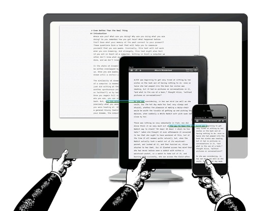
When mobile devices became the norm, the definition began to change. Screen resolution was altogether more important, as it had to fit into both small and large screens. But phones were more or less the same size, and so designers began creating two different layouts, one for small screens and one for standard computer screens. But then came tablets, and larger computer screens, and new devices that put the resolution at all measurements in between.
It no longer made sense to create different websites for each. All it did was take way too much time, and had no value to devices that might be created in the meantime – which meant we had to begin looking for responsive designs that could use a single layout to adapt to each format, regardless of resolution. A task that designers took up with gusto and to great effect.
Now we have a more direct issue to address, within that range of solution. That is the use of responsive typography.
What Is Responsive Typography?
Related to responsive layout design, this is a single part of the larger puzzle. It is the use of fonts that adapt to different resolutions so they are still viewable, with the overall layout still intact. Unlike using a simple font for a separate mobile site, you are using a font that is an complex as you like, which will stretch or shrink according to the screen’s need. All while remaining readable and clean looking, and without overlap or other readability issues.
Much of this is already incorporated into the process of making a responsive design (such as the size, width, adaptability, ect of the letter on the site). Yet, a truly responsive typography will give you more than just the most basic look.
Choose Your Font
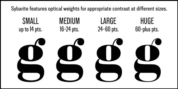
You can break down your choice by looking at smaller issues within the question. For example, your first decision will be based around whether to use serif or sans serif. I have read a number of blogs out there that claim all responsive typography must be sans, as anything in serif form will be too blurry on the page when adapted for certain screens. A rumor that is entirely false; serif is just fine, in larger pixel quantities to improve the sharpness of the font.
Of course, you then have to compensate should you choose a secondary font for the design that is sans serif. But I usually recommend against doing that, and sticking with either all serif or all sans fonts on any design. Not everyone will agree with me there, so if you do choose to mix the two just make sure the serif is at a pixel quantity of more than twelve, and the sans is below it. A little bit of experimentation should give you proper amounts for both, based on the finished look in the layout itself.
The rest is going to be based around the same rules of thumb you would hear from any typography lesson:
- Make sure there is plenty of border space in the desktop version, aligning all of the text well so that is shows clearly when adapted for a smaller screen.
- Double space between lines to keep both the layout from looking cramped, and the text overlapping when adapted for mobile.
- Use proper contrast between text and background, as the smaller the screen the sharper the image must be for easy reading. Less contrast harms readability.
One tip I do usually offer is to be wary of high detail fonts when designing anything responsive. That text with the little flowers in the margins of the words might be both charming and perfect for your gardening site. But when shows on a smaller resolution the details will almost certainly be blurred, or even appear blotted and messy. A clear, crisp font is always best.
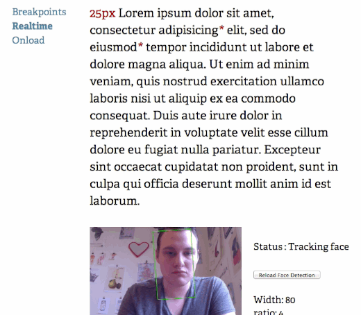
The Responsive Typography Experiment
An fun experiment by Marko Dugonjic has taken responsive typography to a completely new level: using face detection, the tool identifies the proximity a user is from his or her screen:
Is this the future of web design?
Tutorials
There a few very detailed and thorough guides on responsive typography; be sure to check them out!
- On Typography …
- A simple guide to responsive typography
- Responsive typography: a quest for flexible typesetting
- A jQuery plugin for generating a responsive ideal measure.
Have any tips for responsive typography? Let us know in the comments.


40 Responses
New @webuildpages: A Look Into Responsive Typography http://t.co/4uNid4LGkw
A Look Into Responsive Typography: The times have really changed when it comes to web design. In the beginning… http://t.co/Xl7JsjYm8J
A look at responsive typography: http://t.co/G0USENYhWV #ux #mobile #web #design
Freshly fresh. A Look Into Responsive Typography http://t.co/lJDl559fVK
A Look Into Responsive Typography: http://t.co/6RflgnljFP #seo http://t.co/AZ5EN71KHq
A Look Into Responsive Typography @NinjasMarketing http://t.co/gLNLXtDps9
RT @seosmarty A Look Into Responsive Typography @NinjasMarketing http://t.co/tF1jxr59wc … This is cool.
A Look Into #Responsive Typography by @seosmarty : http://t.co/iTWBU5Iumf
RT @seosmarty: A Look Into Responsive Typography @NinjasMarketing http://t.co/zoBy4YZyjs
A Look Into Responsive Typography @NinjasMarketing http://t.co/cw1lS7Baxs
A Look Into Responsive Typography @NinjasMarketing http://t.co/UMbcGaGhpX
A Look Into Responsive Typography @NinjasMarketing http://t.co/Q36lKfUykX
A Look Into Responsive Typography @NinjasMarketing http://t.co/NXPTcBPmb9
A Look Into Responsive Typography @NinjasMarketing http://t.co/wJnxuABlEx
A Look Into Responsive Typography @NinjasMarketing http://t.co/n8xvEzTOb9
A Look Into Responsive Typography @NinjasMarketing http://t.co/g3OT1uYxc6
A Look Into Responsive Typography @NinjasMarketing http://t.co/ixwoS2Ensh
RT @Vanetcetera A Look Into Responsive Typography @NinjasMarketing http://t.co/OIesBb7WxV
A Look Into Responsive Typography http://t.co/eIt1BJkSA5
Responsive Typography: Keep your complex font, and your content layout @NinjasMarketing http://t.co/eiYOcevw6D
RT @cwills: A Look Into Responsive Typography http://t.co/eIt1BJkSA5
RT @cwills: A Look Into Responsive Typography http://t.co/eIt1BJkSA5
RT @cwills: A Look Into Responsive Typography http://t.co/eIt1BJkSA5
A Look Into Responsive Typography http://t.co/CNo12l84mW #design #webdev
RT @cwills: A Look Into Responsive Typography http://t.co/eIt1BJkSA5
A Look Into #Responsive #Typography http://t.co/vW13ESxRGG
Anne Smarty article on Responsive Typography – interesting and visual http://t.co/4AqdrcGEDt
RT @cwills: A Look Into Responsive Typography http://t.co/eIt1BJkSA5
Wow. I haven’t heard about this until now. I mean, responsive typography is a new term for me, but the concept is not. I like how comprehensive this article is in discussing this topic. I’ve learned a lot.
I especially like the responsive typography experiment where one can use face detection. Awesome, really!
Thanks for the other links for tutorial. I’ll look into it later. 🙂
Riza, Kingged.com contributor
RT @cwills: A Look Into Responsive Typography http://t.co/eIt1BJkSA5
A Look Into Responsive Typography http://t.co/tLuT0vzl9D
A Look Into Responsive Typography http://t.co/UiLL61um9E
#webdesign
RT @RobCubbon: A Look Into Responsive Typography http://t.co/UiLL61um9E
#webdesign
For all good reason, this post is helpful and one that has practical lessons. Internet marketing is an adaptive process and it is doing this through innovative technology. Its really not surprising that many marketers and brands are adopting responsive websites.
That said, thanks for sharing this post. Its readily throws more light into the meaning of responsive typography 😉
This comment was left in kingged.com where this post was “kingged”.
Sunday – kingged.com contributor
http://www.kingged.com/a-look-into-responsive-typography/
Responsive Typograhy http://t.co/dC24Htu9Zx #design #police EN
A Look Into Responsive Typography http://t.co/NEA5ebmt8g
RT @AlexOnUX: A look at responsive typography: http://t.co/XFstM9VIq7 #ux #mobile #typography #design via @anthonydpaul
RT @seosmarty: A Look Into Responsive Typography @NinjasMarketing http://t.co/gLNLXtDps9
RT @seosmarty: A Look Into Responsive Typography @NinjasMarketing http://t.co/gLNLXtDps9
A Look Into Responsive Typography @NinjasMarketing http://t.co/wyvyCCM7Kk
Comments are closed.